1. Mobile Audience Behaviour
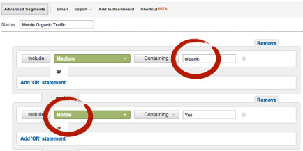
1.1. In your site
Use the Google Analytics “Mobile” dimension to create an advanced segment for the organic traffic coming from mobile devices, its volume, trend, devices, most popular landing pages and keywords used.
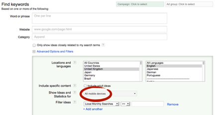
1.2. In Google’s Mobile Search
Use the Google AdWords Keyword Tool mobile filter to see the keywords used by your audience to search from their mobile devices.
2. Site Behaviour
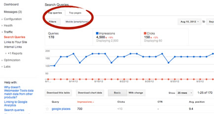
2.1. In Google’s Mobile Search Results
Use Google Webmaster Tools to see the top queries and pages showing in Google’s mobile search results.
2.2. In Mobile Devices
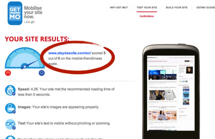
To test how your mobile visitors and search bots reach and see your site use:
- Google’s Getmometer
- PageSpeed Insights
- Google Webmaster Tools “Fetch as Google mobile bot” option.
- Screenfly
- HTTP Web Sniffer
- User Agent Switcher for Firefox
3. Mobile Web Development and Optimization Tips
3.1. Mobile Site Alternatives Pros & Cons
All alternatives have Pros and Cons and although the best for SEO is going with responsive Web design it might not be suitable depending on your technical capacity and content differentiation needs.
- Responsive Web Design

- Dynamic Serving

- Parallel Mobile Site
3.2. Mobile SEO Best Practices
In general:
- Make sure to optimize page speed, especially important for mobile due to bandwidth restrictions.
- Validate that mobile users see the same than the mobile search engines bots and avoid cloaking.
More specifically, for each type of alternative:
- Responsive Web Design

- Dynamic Serving

- Parallel Mobile Site

Take a look at Google’s recommendations to build mobile optimized Websites.
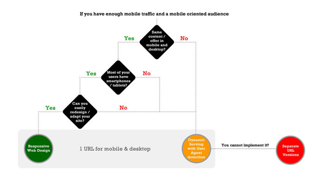
4. Mobile Web Decision Flowchart
Follow this Mobile SEO flowchart (that I originally posted at State of Search) to decide if you should build a new responsive Web, implement a dynamic serving site or build a parallel mobile version depending on your situation.
